Atlas of the Invisible: using data to map the climate crisis.

Graphics from a new book show causes and consequences that are hard to detect with the naked eye.
In a new book, Atlas of the Invisible, the geographer James Cheshire and designer Oliver Uberti redefine what an atlas can be. The following eight graphics reveal some of the causes and consequences of the climate crisis that are hard to detect with the naked eye but become clear when the data is collected and visualised.
Fasten your seatbelts
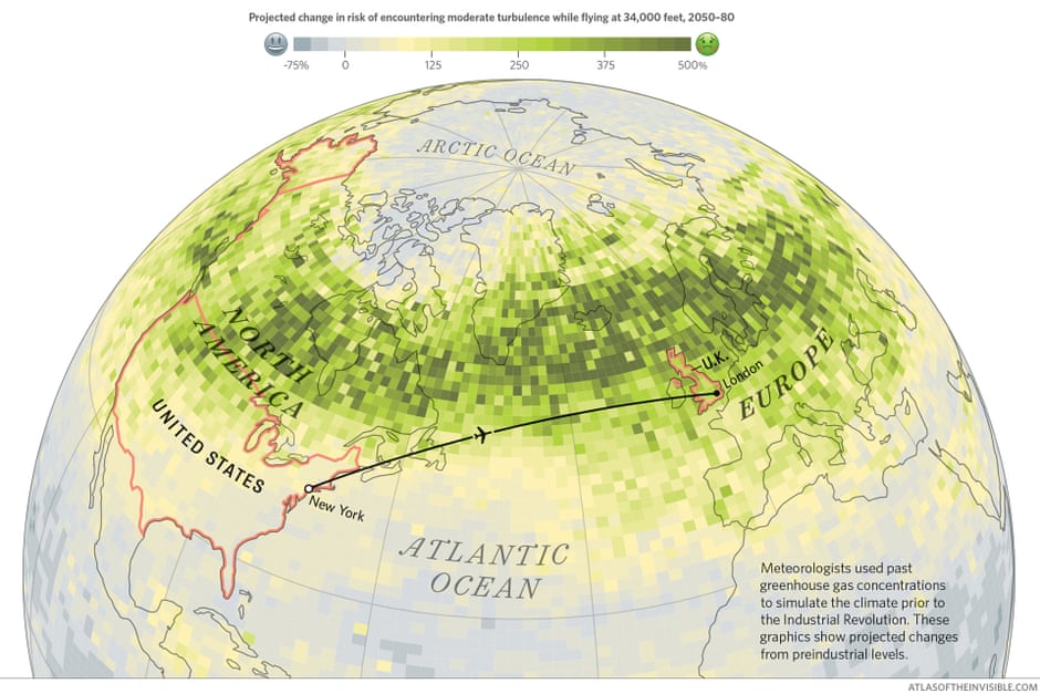
The Federal Aviation Administration in the US reported only nine serious injuries from clear-air turbulence out of 1 billion passengers in 2018, but the risk persists because neither captains nor their onboard instruments can see rough air ahead; instead they rely on other pilots and flight dispatchers to warn them. In recent years meteorologists have alerted aviators to bigger bumps coming this century. Simulations show that as the climate crisis makes jet streams more erratic, the chances of encountering turbulent airspace will soar, especially in autumn and winter along the busiest routes. All the more reason to cut back on transatlantic flights.
Light levels
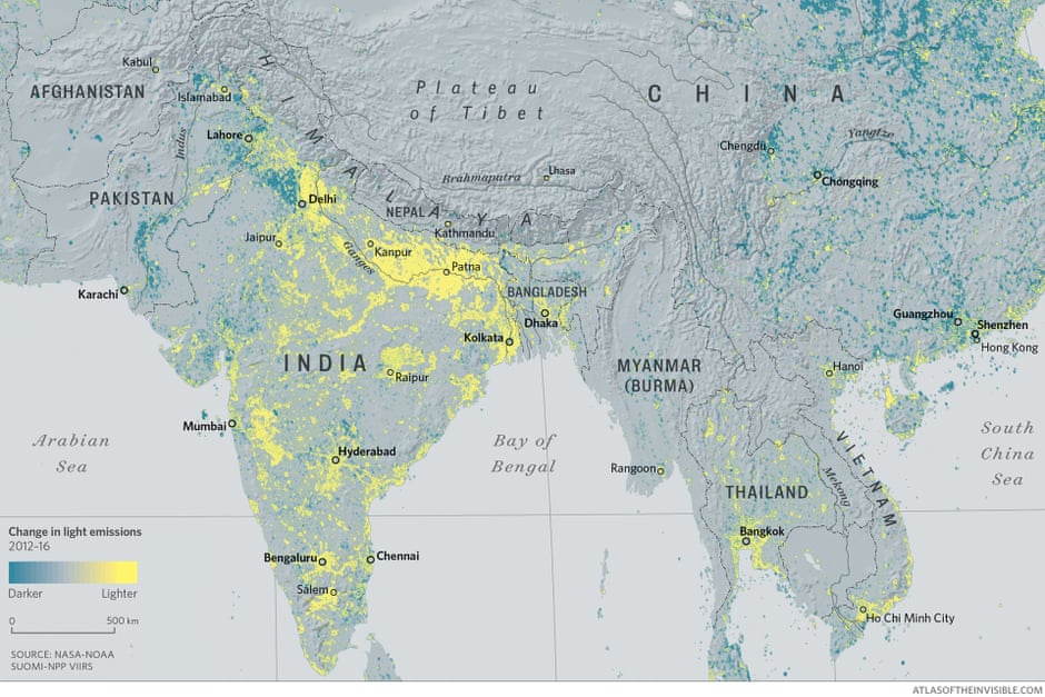
In recent years, a revolutionary light sensor and the advent of algorithms to remove moonlight and other natural variables have allowed satellite imagery to be comparable from night to night and year to year. Here we have combined light emissions data from 2012 and 2016 to reveal places where lights have switched on (yellow), where they have dimmed (blue) and where they have remained the same (grey). From these patterns, it is possible to see the effects of war, economic development and urbanisation. More than 25m households in India have received electricity since Narendra Modi was elected as prime minister in 2014, while rural areas in China are dimming as coastal cities light up.
Heat gradient
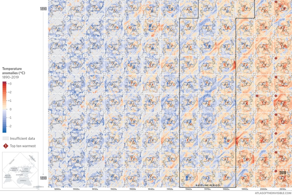
One of the chief misconceptions about the climate crisis is that warming will be uniform. Deniers cite a cold front here, a blizzard there as proof that climate science is bunk. Such bad-faith arguments ignore the difference between weather and climate. Weather blows through; climate takes off its coat and stays a while. Each tile represents one year from 1890 to 2019, coloured by how and where temperatures deviated from a reliable baseline period (1961-90). Reading the decades left to right reveals an alarming pattern. While heatwaves and cold spells speckle the grid, tiles for the current century are flush with warm tones. Including 2020, the 10 hottest years on record have occurred since 2005.
Ice flows
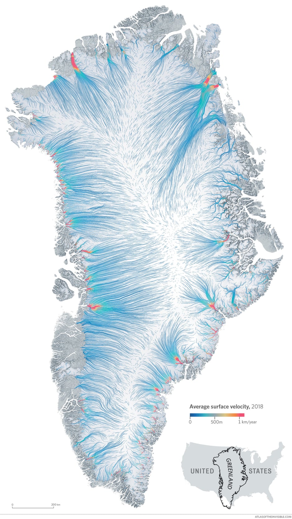
Beneath Greenland’s dome of snow and ice, nearly 100 glaciers drain from a central ridge. Winding valleys in the east slow their speeds, whereas heavier snowfall in the north-west supercharges a straight run out to sea. On this map, warmer colours indicate faster movement. Greenland has about 5,000 gigatons less ice than it had 20 years ago. Part of the problem is that once melting starts it is hard to stop. Pools of warm meltwater eventually seep into the glacier. This softens and lubricates its base, speeding its slide to warmer elevations where the ice softens further and slides even faster.
One stormy sea
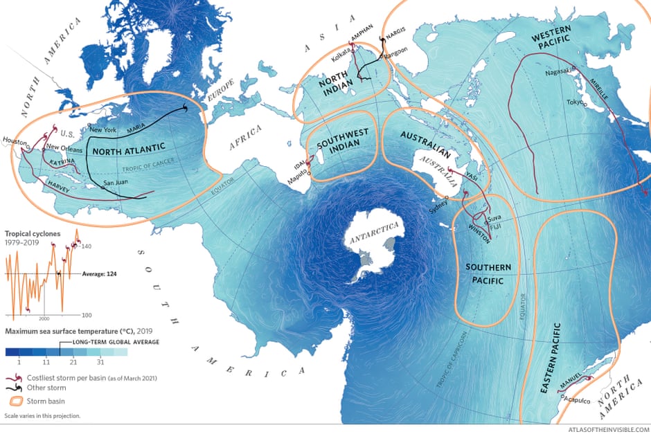
This map views the world’s oceans as an interconnected body of water. In the past 50 years this singular mass has retained more than its fair share of the excess heat trapped by greenhouse gas emissions. As a result, sea surface temperatures are increasing rapidly. In 2019, waters in the Arctic exceeded their historical average by 7C. Warmer water pumps more moisture into the air and disrupts atmospheric currents, leading to bigger, stronger, slower and wetter storms. The number of tropical cyclones worldwide has also increased, with many of the costliest storms occurring since 2005.
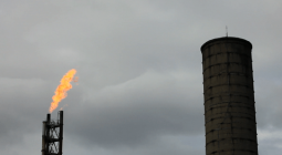
Carbon overhead

When we look up into a blue sky and see a white plume trailing a silver plane, air travel can seem harmless, even pretty. A darker truth is emerging. Choosing to fly is one of the most carbon-intensive choices an individual can make. This map depicts a week’s worth of flights over Europe. A return flight from London to Istanbul emits more CO2 than the average citizen in many countries will in a year – and that is not counting the doubling effect of contrails.
In exhaustive detail
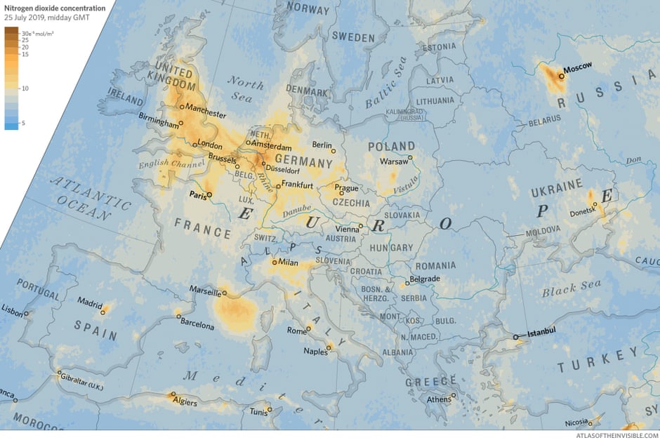
Since 2017, the European Space Agency’s Tropospheric Monitoring Instrument (Tropomi) has provided daily global readings of nitrogen dioxide, sulphur dioxide and particulate levels in the atmosphere. Here we show plumes of nitrogen dioxide on one of northern Europe’s warmest days in 2019. Air travel is largely responsible for the noxious wake between Amsterdam and London; the Alps cause industrial pollutants to pool over northern Italy; Marseille needs a stiff breeze to dissipate the fumes from cruise liners; and high pressure conditions can keep urban exhaust swirling over the UK.
Burn scars
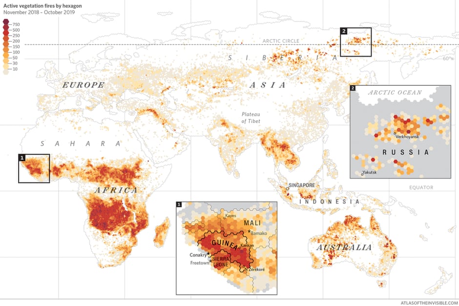
Farmers throughout the world set fires to clear land for crops or livestock. In Africa, the red bands on this map reflect the shift of seasons across the equator. In Russia, fire data tells a different story. Temperatures hit 38C in the town of Verkhoyansk on the longest day of 2020. It was the hottest day on record north of the Arctic Circle. Such heat turned forests to tinder; drying peatlands became underground fuel. In the data from fire-detecting satellites, atmospheric scientists noticed an ominous pattern: the sites of Siberia’s fires in 2020 aligned with many from 2019, which suggests they may have never burned out.
September 2021
The Guardian