Scientists just released a map of all 2.75 billion buildings on Earth, in 3D
A new global atlas captures humanity’s entire built environment—from megacities to remote villages.
From a digital vantage point in orbit, scientists have mapped every building on Earth—2.75 billion structures, all in 3D.
Researchers at the Technical University of Munich (TUM) have unveiled the GlobalBuildingAtlas, the first high-resolution 3D map of all the world’s structures. Compiled from satellite imagery dating back to 2019, the atlas charts exactly where people live and how their buildings rise and spread across the continents.
“With 3D models, we see not only the footprint but also the volume of each building, enabling far more precise insights into living conditions,” said Prof. Xiaoxiang Zhu, who leads the Chair of Data Science in Earth Observation at TUM and headed the project.
A Planet of Buildings
The sheer scale of this undertaking is staggering. Previous global building maps captured roughly 1.7 billion structures. This new dataset pushes that count to 2.75 billion, offering a resolution thirty times finer than earlier efforts.
Each building appears as a 3-by-3-meter model. That is detailed enough to estimate its height, volume, and spatial relationship to its neighbors.
The research, published in Earth System Science Data on December 1, is the culmination of years of work combining data from multiple satellites, processed through algorithms trained to distinguish rooftops from roads, trees, and terrain. Ninety-seven percent of the buildings are represented as Level of Detail 1 (LoD1) models—simplified three-dimensional forms that capture each structure’s geometry and elevation.
The project is open to the public. Anyone can explore it online, zooming from a continent-wide perspective down to a single neighborhood, even remote villages. Users can even enter a specific address to see a building’s location and elevation on the interactive map.
“3D building information provides a much more accurate picture of urbanization and poverty than traditional 2D maps,” Zhu said. “We introduce a new global indicator: building volume per capita, the total building mass relative to population—a measure of housing and infrastructure that reveals social and economic disparities.”
The metric could reshape how researchers track inequality. Wealthier areas tend to have larger volumes of buildings per person, spacious homes, wider streets, taller structures. On the other hand, densely populated, low-income regions often show the opposite. This ratio, mapped across countries, provides a visual measure of economic development and living standards.
Governments and humanitarian organizations can identify where housing shortages are most acute, where public services are strained, or where informal settlements expand fastest. “The 3D building data from the GlobalBuildingAtlas provides a precise basis for planning and monitoring urban development,” Zhu said. “It enables cities to take targeted measures to create inclusive and equitable living conditions.”
Closing the Data Gap
For decades, global building datasets leaned heavily toward wealthy nations. Satellite images from Europe, North America, and East Asia were abundant. Meanwhile, data from Africa, South America, and Southeast Asia remained sparse or unreliable.
The TUM team made inclusion a priority. Their algorithms filled gaps across rural and previously under-mapped regions, correcting biases that have long plagued Earth-observation data. The result is a truly global picture—from the towers of Manhattan to the farmhouses of Kenya.
That coverage could transform development planning in the Global South. Urban expansion can now be monitored with unprecedented granularity, enabling early interventions before infrastructure strains or informal settlements become entrenched.
Beyond urban studies, the dataset has immediate implications for the planet’s changing climate. Buildings account for nearly 40% of global CO₂ emissions. Knowing their height, density, and distribution can sharpen models of energy demand and greenhouse-gas output.
Data Driven Decisions
The GlobalBuildingAtlas arrives at a moment when humanity’s footprint is expanding faster than ever. By 2050, nearly seven in ten people will live in cities. For scientists and policymakers racing to adapt to that growth, the atlas reflects what has been built and points toward what must come next.
It also empowers open science. Anyone can download the data and code from GitHub, explore their own neighborhood, or use the information to study how cities evolve.
For Zhu, the work is just beginning. The next steps involve integrating temporal data to show how the built environment changes over time—how cities rise, sprawl, or decay.
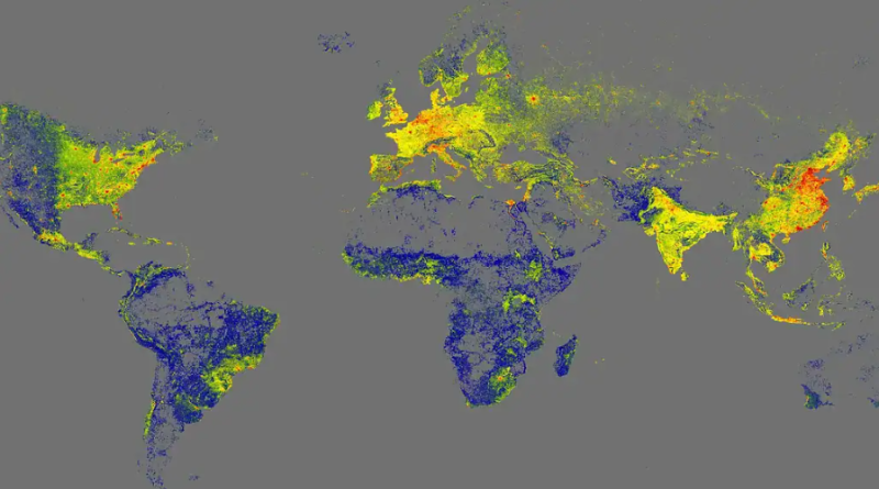
Cover photo: Screenshot of the map in question