Can climate stripes change the way we think about air pollution?

02 09 2024 | 07:02Gary Fuller

The climate stripes reveal the change in air quality when governments are forced to act. Photograph: Beijing Youth Daily/VCG/Getty Images

A team of scientists have created a new way to visualise the contrasts in air pollution breathed around the globe. The results show huge inequalities in the quality of air, with the situation worsening in many countries.

But the new project also tells a positive story: that focused action by governments can lead to cleaner air.

Inspired by Ed Hawkins’ climate stripes, the new air quality stripes show air pollution from 1850 to today. Each year is a separate vertical bar that is coloured according to the amount of particle pollution. Air that meets World Health Organization guidelines is coded as sky blue. Shades of yellows, browns and black represent higher pollution in a colour scheme that reflects more than 200 images of smog from around the world.

x

Dr Kirsty Pringle, of the University of Edinburgh, who co-directed the project, said: “Air pollution is often called the invisible killer but these images make the invisible visible, showing the changes over the decades.”

The website allows you to generate your own air pollution stripes for large cities.

Dr Jim McQuaid, of the University of Leeds, another co-director of the project, said: “To me it’s all about that lightbulb moment when someone understands it; that sudden ‘oh yeah, now I get it’.”

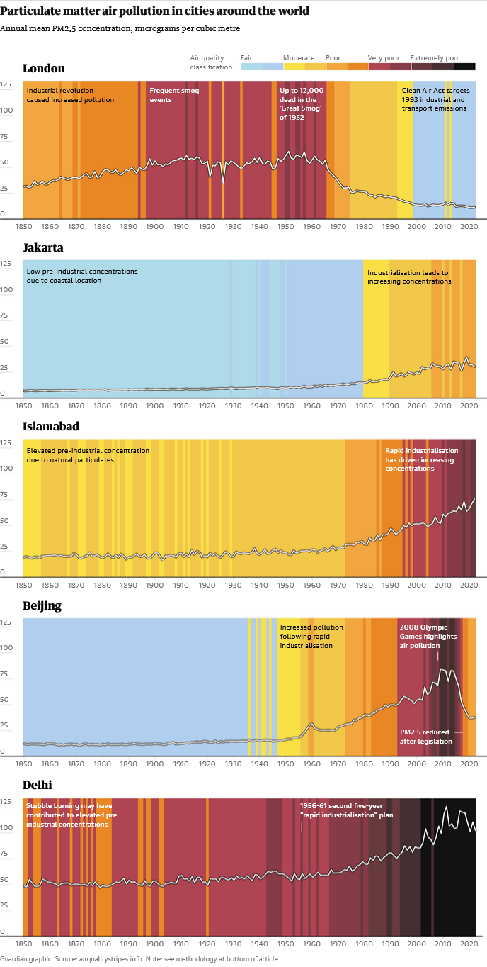
The stripes for London and Beijing show the huge improvements that can result when action is taken.

For more than a century London was plagued by coal induced smogs so thick that they were likened to pea soup. A reluctant government was finally forced to act when 12,000 people died from a week-long smog in 1952. Clean air acts followed. Coal use was replaced by heating oil and then fossil gas.

Beijing’s deteriorating air was largely unnoticed until the eyes of the world turned to the city for the 2008 Olympics. By this time air pollution deaths in China had reached more than 2 million a year, but a recent clean-up of industry and traffic has yielded rapid initial results.

Jakarta and Islamabad represent the trajectories of many developing nations with rapid urbanisation and industrial growth and without accompanying air pollution controls.

Data for the stripes came from the UK Met Office’s global climate models with adjustments from satellite observations that first became available around 1998. This adjustment was also applied past pollution, projected backwards to 1850 using fuel and energy statistics.

On their website, the team responsible observe: “Very few historical observations of PM2.5 exist before the year 2000 so instead we use data produced from a mix of computer model simulations and satellite observations. For the most recent years (2000-2021) we use a dataset that combines ground-level and satellite observations of PM2.5 concentrations from Van Donkelaar et at (2021, V5 0.1 degree resolution), this dataset can be found here.”

They added: “Modelling global concentrations of pollutants is very challenging, and models are continuously evaluated and improved. Previous research has shown that the CMIP6 multi-model simulations tend to underestimate PM2.5 concentrations when compared to global observations (Turnock et al, 2020).

“To address this issue and to ensure a smooth time series between the model and satellite data, we take the following steps: for each city, we first calculate a three-year (2000-2002) mean of the satellite data for that city. Next, we calculate the three-year (2000-2002) mean of model concentrations for the same city. The ratio between these values represents the model’s bias compared to observations. We then adjust (or “weight”) the model values using this ratio. This is a similar approach to that taken by Turnock et al (2023) and Reddington et al (2023).”

Predictions are made for each degree of longitude and latitude. For the UK this is around 60km (40 miles) by 110km (70 miles), so the stripes cannot show the detail of air pollution within each city, but they do illustrate the changes.

More than 99% of the world’s population still breathe air that does not meet World Health Organization guidelines. Even after the improvements seen in Europe, particle pollution still leads to more than 400,000 early deaths annually; for the UK it is between 29,000 and 43,000.

Prof Ed Hawkins, of the University of Reading, who created the climate stripes, said: “The climate stripes have appeared on the white cliffs of Dover, on football kits and race cars, at music festivals and at London fashion week.

“By making abstract data tangible, we can all play a part in solving some of the world’s biggest problems. Many major cities worldwide are still struggling with dirty air, but air quality is improving in other places. These are clear demonstrations that critical global issues can be solved with enough political will.”

g