The statement shirts making climate data fashionable at Cop26
With stripes showing temperature rise in the polar regions, the shirts are designed to start conversations about global heating
Cop26 may not be the first place that springs to mind when thinking about fashion, but stripes were all the rage in Glasgow this week, where striking white, blue and red shirts were the latest must-have piece for fashion-forward scientists. These statement shirts may look like some 70s throwback but they have been designed using the latest polar data.
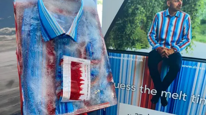
Climate data is not a natural conversation starter but the shirts, made by Cambridge-based company DressCode Shirts, are designed to get people’s attention. They tell the story of two datasets, which show how rapidly polar regions are warming, using soft blues to represent colder temperatures and reds to show hotter ones.
The stripes on the body of the shirt represent 70 years of warming in the Arctic, from 1950 to 2020. On the cuff is a graph depicting 800,000 years of Antarctic temperatures and CO2 data, which shows how closely the two are linked. The single black button represents the ozone layer.
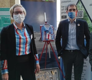
“We’ve had some jaws drop today,” says Pilvi Muschitiello from the British Antarctic Survey (BAS), who helped design the shirts and has been modelling them in the green zone. “A lot of people are very enthused when they see the shirt. People are surprised just looking at the CO2 levels and the historical record, as well as where we are today,” she says.
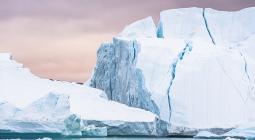
Scientists from BAS are researching polar regions, looking at a range of issues, from what iceberg carving does to ecosystems to how melting is making them less habitable for polar wildlife. The aim of the clothing line is to help people engage with complex scientific data.
“We want to show the different timescales of these changes so people can understand the urgency of this situation. We also want to engage with the data in more creative ways because that’s part of how we will find better solutions for the future,” says Muschitiello.
The barcode of vertical stripes is also trending on face masks, ties, scarves and even dresses at the conference. They were made using an algorithm created by Ed Hawkins, professor of climate science at the University of Reading. His original design shows temperature increases from 1850 to 2020, with each stripe representing one year. Even Ed Miliband is a fan and was spotted sporting a scarf bearing the stripes.
“Starting conversations about climate change is key to engaging everyone with the urgent need to cut greenhouse gas emissions,” says Hawkins. “Using fashion is another example of how the warming stripes have been used as inspiration for enabling these conversations with different audiences.”
As part of the promotional display at Cop, scientists from BAS froze one of the shirts and ran a competition to see who could guess when it could thaw. The shirt was put out at 8.30am and defrosted at around 7pm, by which time all the ice had disappeared. “This is an analogy for what is happening to our planet. It shows the effects that climate change is having in the polar regions,” says Muschitiello.
The shirts were designed by Andy Boothman, founder of DressCode Shirts. They are made from sustainable wood pulp and are printed digitally to save water. The shirt costs £125, or £160 for one with a chip in the cuff, which means the wearer can use it to make contactless payments.
“Clothing has an amazing role in our lives,” says Boothman. “We’re passionate about making clothing with real stories backed up by science. The reaction has been phenomenal.
“It’s been great to work with the scientists and get a deep understanding of what they’re doing and how things are being measured. When you start talking about an 800,000-year dataset, it just blows your mind. The challenge is to make that into something simple enough to be engaging.”
The shirt was released two weeks before Cop26 at the Cambridge Clean Tech 10th anniversary conference. They can be bought online and come in three sizes for men and women.
Researchers now want to look at other big datasets that could be displayed on a shirt, such as sonic data showing the amount of krill in the ocean.
The fashion writer’s verdict
Colour is always appreciated by style watchers - and if that colour has a “if you know, you know” kind of meaning, so much the better. Repurposing Ed Hawkins’ infographic on shirts, ties, scarves and, inevitably, face masks gains approval for these factors alone.
Judged solely as sartorial statements, however, the interpretations are a mixed bag. A pattern as busy as this is a brave choice to wear as a clothing item rather than accessory. At first glance, and without the reference, a shirt with the global heating infographic looks more like something found in the gift shop for a Bridget Riley exhibition.
Masks get a pass because we’re now used to all sorts of patterns on people’s faces, but a tie with the infographic width-ways is a bit distracting. It’s certainly not one for a video call.
Ed Miliband - typically a bit overshadowed by his brother David and his sharp suits, when it comes to style - is the surprise style success story here. Hawkins’ pattern transposed to a scarf adds a jazzy detail to Miliband’s otherwise-plain outfit but its success comes from an impact beyond aesthetics.
With the infographic covering the length of a scarf, the visual effect showing how the planet’s temperature has warmed from blue to red over time is made more explicit - you can see it better, basically. And, arguably, that’s the most important thing.
Lauren Cochrane
Find more age of extinction coverage here, and follow biodiversity reporters Phoebe Weston and Patrick Greenfield on Twitter for all the latest news and features
5 November 2021
The Guardian